
Change the Time Context
Change the granularity, time period, and time window for your charts.
Access requirements
Permission with these capabilities: Change Analysis Context
Reach out to your administrator for access.
Change the time context by using the Time picker in the Analysis Context toolbar, which is located at the top of charts and analyses.
In the Time picker, you'll find options to change the granularity, time period, time window, for your charts. You will only be available to change the time setting on individual chart cards in anlayses that are set to Update automatically or Select a specific time period.
For more information about these components, see The Time Context.
The appearance and options available in the Time picker are based on the visual that you've selected. For time-based visuals, where data is displayed over time, you'll find options to set the granularity, time period, time window, and time setting. For non-time-based visuals, where data is displayed in groups, you'll find options to set the granularity, time period, and time setting.
How to change the time context for Time-based visuals
Time-based visuals, such as Trend and Trend Breakdown, display time on the x-axis. The following screenshot shows the Time picker for time-based visuals.
Tip: Watch this video to learn how to change the time context for Time-based visuals.
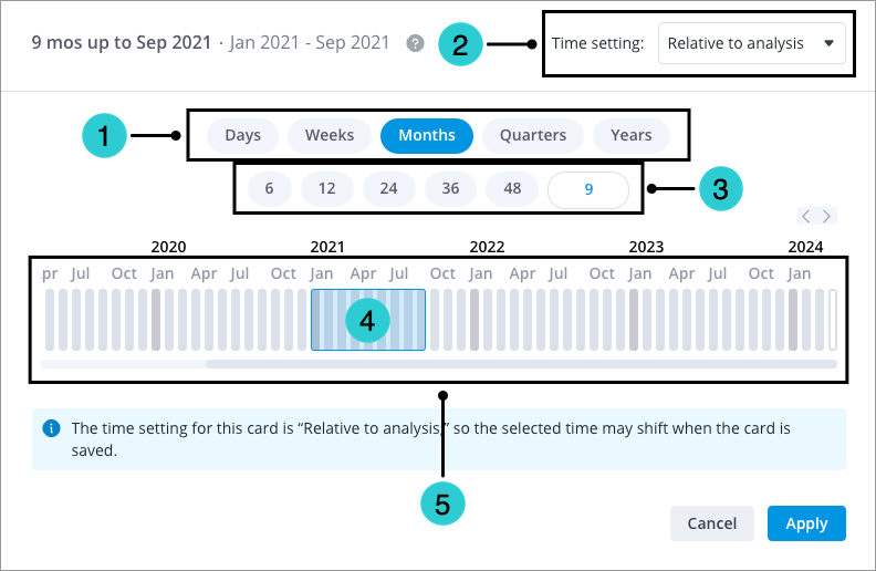
- Time granularity: Select the granularity at which to view your data.
- Time setting: Select if you want the data in the chart to be fixed at a certain time context of your choosing or update relative to the time context that is chosen for the overall analysis.
Note:
- The analysis context must be set to Update automatically or Select a specific time period in order to set the time setting.
- Setting the Time setting is only available for individual chart cards in an analysis.
- Data in charts with a fixed time setting will not change when the time period or granularity of the analysis is changed, even if the analysis has the time granularity synchronized. Fixed charts will be indicated by a lock icon
 beside the time period. For more information, see The Time Context.
- Time window picker: Select the number of periods to display on the chart. You can customize the number of periods that are displayed.
- Time window: Shows the number of periods displayed on the chart. You can drag the edges of the box to extend or reduce your time window.
- Time period: Drag and slide the time window along the timeline to select the time period or range of periods that you want to analyze. You can also move the selection by clicking on a time period.
How to change the time context for Non-time-based visuals
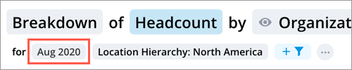
Non-time-based charts, such as Breakdown, Bubble Grid, Organization, and Scatter Plot, don't display time on their axes. The following screenshot shows the Time picker for non-time-based visuals.
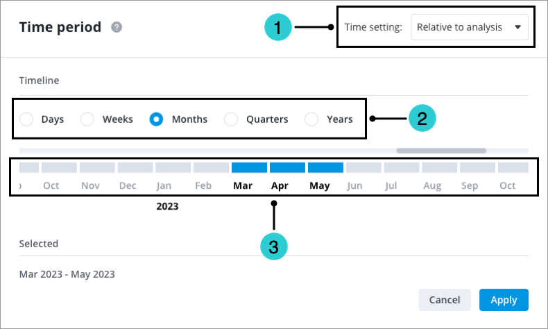
- Time setting: Select if you want the data in the chart to be fixed at a certain time context of your choosing or change according to the time context that is chosen for the overall analysis.
Note:
- The analysis context must be set to Update automatically or Select a specific time period in order to set the time setting.
- Setting the Time setting is only available for individual chart cards in an analysis.
- Data in charts with a fixed time setting will not change when the time period or granularity of the analysis is changed, even if the analysis has the time granularity synchronized. Fixed charts will be indicated by a lock icon beside the time period. For more information, see The Time Context.
- Time granularity: Select the granularity at which to view your data.
- Time period: Select the time period or range of periods that you want to analyze.
Note: Depending on the metric that you've selected, data will be aggregated over your selected time periods for non-time-based visuals. For more information, see Metrics.
Data and the selected time period
When selecting a time period, the timeline shows the data that is available for each period.
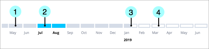
- Filled boxes indicate completed time periods.
- Blue boxes indicate selected time periods. These periods may contain any combination of completed, partially-completed, and future data.
- Partially-filled boxes indicate partial time periods, which we do not have complete data for. Data is still being collected and loaded into the solution as the period has yet to end.
- Unfilled boxes indicate future time periods, representing data such as known hires that have not yet started, plan values, and projected values. Future periods will be available in the Time picker when you select a metric that has future events.
For more information about the time context that can be selected for analysis, see How the Available Time Selection is Determined.